The fifth call for testing is already underway, so join #fse-outreach-experiment in slack and/or subscribe to this Make blog and stay tuned for more.
This post is a summary of the fourth call for testing for the experimental FSE outreach program. Thank you to everyone who participated, whether through testing directly or sharing the call for testing with others. It all helps! Special thanks to the following people:
- @piermario for translating the call for testing into Italian!
- Yoast, for helping run through the test during their internal contributor day and processing loads of feedback from the experience.
How far can one go?
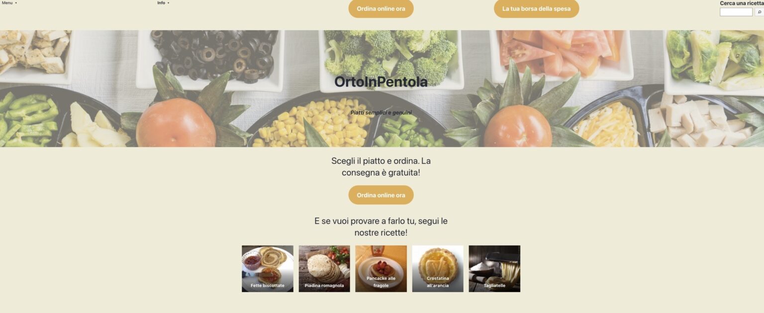
It’s always fun to see how far people can take these tests in creating something cool without code. Here are a few screenshots of people’s creations that make me hungry just looking at them:


High-Level Feedback
Here’s what a few folks had to say about the overall experience that’s important to keep in mind as you read the rest of this post:
All of this could be because of my inexperience with GutenbergGutenberg The Gutenberg project is the new Editor Interface for WordPress. The editor improves the process and experience of creating new content, making writing rich content much simpler. It uses ‘blocks’ to add richness rather than shortcodes, custom HTML etc.
https://wordpress.org/gutenberg/ the pluginPlugin A plugin is a piece of software containing a group of functions that can be added to a WordPress website. They can extend functionality or add new features to your WordPress websites. WordPress plugins are written in the PHP programming language and integrate seamlessly with WordPress. These can be free in the WordPress.org Plugin Directory https://wordpress.org/plugins/ or can be cost-based plugin from a third-party.. I’m used to working with Astra and other blockBlock Block is the abstract term used to describe units of markup that, composed together, form the content or layout of a webpage using the WordPress editor. The idea combines concepts of what in the past may have achieved with shortcodes, custom HTML, and embed discovery into a single consistent API and user experience. libraries rather than the coreCore Core is the set of software required to run WordPress. The Core Development Team builds WordPress. blocks.@suhayse in this comment.
The most problematic issue is that what I saw in the editor was not what I got on the front end. I have played around with it enough to know in my mind what it might look like on the front end to make adjustments without previewing the changes. However, that is not the user experience that WordPress is shooting for.
@greenshady in this WP Tavern post.
Most of us were confused by the current UXUX UX is an acronym for User Experience – the way the user uses the UI. Think ‘what they are doing’ and less about how they do it. and UIUI UI is an acronym for User Interface – the layout of the page the user interacts with. Think ‘how are they doing that’ and less about what they are doing. of the full site editing experience. For some of our colleagues, this was the first time using the block editor for a whole day.
@francesca in this Yoast blog post.
Repeated Feedback: Improving saving, desire for a preview option, and differences in spacing
As with last time, to better consolidate repeated pieces of feedback, this section only contains new bugs or enhancement requests while still sharing quotes that highlight how these areas continue to be a pain pointPain point Pain points are “places where you know from research or analytics that users are currently getting hung up and have to ask questions, or are likely to abandon the site or app.” — Design for Real Life. In this case, keep in mind that spacing refers to everything from differences between the front end and back end to enhancement requests around setting the width of various blocks. In general, though, it further underscores how the differences in experience between the editor and front end break the promise of WYSIWYGWhat You See Is What You Get What You See Is What You Get. Most commonly used in relation to editors, where changes made in edit mode reflect exactly as they will translate to the published page. currently. Thankfully, lots of work is underway to continue iterating on this aspect of the experience!
- [Bug] “Update Design” activates inconsistently, which hints at work needing to be done to make sure changes are properly captured.
- Discussion on what to do about the Editor Styles Wrapper Padding for block themes which causes padding to appear in the site editor that doesn’t appear on the front end.
One frustration point was the ability to preview as others have mentioned (the live site definitely looked different from the dashboard preview). When I did view the live site, there wasn’t any margin or padding on the main headerHeader The header of your site is typically the first thing people will experience. The masthead or header art located across the top of your page is part of the look and feel of your website. It can influence a visitor’s opinion about your content and you/ your organization’s brand. It may also look different on different screen sizes. section but there was on the added column set on the top, even though both were set to full width. I tried changing that main header column width back to wide, saving, then going back to full width but it didn’t help.
@suhayse in this comment.
Another thing I noticed was that some small changes, like adjusting the percentage width of the individual columns didn’t activate the “update design” button.
@suhayse in this comment.
I click to Update Design. As there is not yet any simple way to preview on the frontend like we do in the Post/Page screen. I copy the site address url and open a new browser tab and paste it into the new tab to see the frontend. The frontend does not show any margin along the left edge.
@paaljoachim in this comment.
I noticed along the way that the Update Design button was greyed out on occasion when I made some adjustments inside the Cover block and other inner blocks. I had to click into various blocks to get the Design button active again so that I could save. (This seemed a bit hard to track.)
@paaljoachim in this comment.
The site editor makes it looks like there is a small margin all around the full-width header. On the site itself, this isn’t seen. I had set a background color for the full-width header which is edge to edge on the site, but has a margin all around it in the editor.
@kristengunther in this comment.
Columns Block Improvements
Because this call for testing required people to make great use of the Columns Block, it was also the focus of a lot of feedback from various participants. Overall, this feedback mainly came down to two interrelated areas: difficulty navigating between nested blocks and confusion around properly setting width. What follows are the new issues created as a result of this call for testing:
- Improve the drop zone when dragging a block into an empty Columns Block.
- Resolve drag and drop issues when trying to move content into the Columns Block.
- Make it clearer how to return to the original width option after inserting a Columns Block.
- Navigating columns with arrow keys is not intuitive.
- Add ability to insert new columns when there is only one column.
- Width options and icons are unclear and don’t seem to reflect what happens. This should be improved in part by this PR.
Testing was smooth overall except when it came to setting the Columns Block to full-width (both in the header and body of the page in the Site Editor). I was unable to set the block to full-width within the Block Toolbar settings. I was able to do this outside of the Site Editor on a fresh page though.
@synorae in this comment.
I see no visual difference from selecting Wide width or Full width in the backend.
@paaljoachim in this comment.
It’s not clear that the symbol/icon is Full width. It would make sense to have arrows to indicate that it should be full width.
Anonymous Yoast employee in this GitHub issue.
I don’t see an option for full width? Ah it’s under alignment. “Alignment” sounds like left/center/right, not the size. What’s the difference between wide and full wide? I don’t see much difference in the preview.
Anonymous Yoast employee in this GitHub issue.
Setting Styles
As part of this test, people explored setting various styles to customize their heading to their liking and bring to life the feeling of a restaurant. Similar to the complexity in navigating between nested Column Blocks, though, setting styles proved to be pretty confusing considering how unintuitive it was to figure out how to properly select and then style the section one wanted to. Tied to this, it wasn’t always clear where one could find the setting that would do what they wanted since various settings are spread across the block toolbar and block settings. In some cases, the setting to accomplish something doesn’t exist yet too! As more work is underway to add in more styling options and normalize block level controls in a more intuitive way, this is an area ripe for continued iteration.
- [Bug] Unable to remove the underline on the Site Title block
- Show Template Part color settings when viewing just the template part in an isolated mode.
- Style changes made to template parts are only applied to one page in a way that feels confusing.
- Color options should be grouped for better consistency.
- The sidebars in the site editor are confusing and difficult to find.
- It is confusing and unexpected that adding background color also adds padding.
- Add rich text options to the Site Title Block.
- Site Tagline Block should have options to make the text bold and italic.
This is global settings vs individual page template settings. It’s pretty confusing right now. I don’t know exactly where I would set universal global header colors. I would expect to be able to do that in the Template Parts/Header but I don’t immediately see how to do that.
@suhayse in this comment.
I found I had to set the background color for my header 3 times, once for the index template (like in your video), once on the page home template, and once on the page template.
@kristengunther in this comment.
Discoverability of settings, not ideal. Some things are in the popup toolbars, others in the sidebarSidebar A sidebar in WordPress is referred to a widget-ready area used by WordPress themes to display information that is not a part of the main content. It is not always a vertical column on the side. It can be a horizontal rectangle below or above the content area, footer, header, or any where in the theme. (both in Site Editor and Appearance), other in the top toolbar. You had to find the cog and the Global Style icons to open more settings.
@francina in this comment.
When you are new to this, you are really wondering if you need to find the settings in the list overview left sidebar, or the cogwheel right sidebar or on the block itself, all the options are all over the place.
Anonymous Yoast employee in this GitHub issue.
Why does the column change size when changing the color in the settings? At least it definitely seemed like it happened that way. That’s unnecessary and unexpected.
Anonymous Yoast employee in this GitHub issue.
General enhancements & feature requests
As with every call for testing, it’s not just for finding bugs! It’s also important to hear about features that people reach for and find are missing. This section is a “catch-all” to cover all additional features that were reported that didn’t nicely correspond with a particular block or categoryCategory The ‘category’ taxonomy lets you group posts / content together that share a common bond. Categories are pre-defined and broad ranging.. This only includes new feedback and doesn’t include previous findings from prior tests:
- Allow for the ability to add a background image to the Group block.
- Post attribute template select list shows the template slug, not the title.
- Use the block name in the “remove block” text in the toolbar setting to make it easier to know what’s being removed.
- Navigation Component doesn’t reflect what is currently being edited making it hard to know where one is in the site editing flowFlow Flow is the path of screens and interactions taken to accomplish a task. It’s an experience vector. Flow is also a feeling. It’s being unselfconscious and in the zone. Flow is what happens when difficulties are removed and you are freed to pursue an activity without forming intentions. You just do it..
- Add support for separators between menu items for the Navigation Block.
Like the first design I was shooting for, I wanted my Navigation items to look like individual buttons, each with a bit of whitespace in between. However, the Navigation block does not currently support adding backgrounds to each nav item. Even if it did, it also does not have a horizontal margin setting to add the spacing.
@greenshady in this WP Tavern post.
Collection of Miscellaneous Bugs
Because this was a more open call for testing, not all bugs fit nicely into a category or theme with many of them being standalone problems. To make it easier for those working on full site editing to get a sense of bugs at a glance, they have all been shared here:
- Post title special characters are encoded in Site Editor. This should be resolved by this PR.
- List View does not update until autosave is triggered.
- Gradient Color options are greyed out in the Global Styles UI.
- Deleting the first item in an InnerBlocks list with delete key causes an exception error. This was found specifically when working with the navigation block but applies to others as well.
- Site Title letter case was not working in Gutenberg plugin 10.3 but has since been fixed with this PR.
- Youtube and Vimeo embeds do not work in the site editor.
- Editing Field expands when both List View & Block Settings are open.