This is a bi-weekly update of work the design group contributed to. Work happens in overview issues, and in needs design, or needs design feedback issues.
If you have updates you’d like to include in the next Design Share, drop a note in the #design channel. If you have questions, you can also ask them there, or as a comment on this post.
Useful Figma files
Useful Tracking Issues
Design work
General Updates
Adjust appearance of sidebar active menu item
Status: Completed | @jameskoster
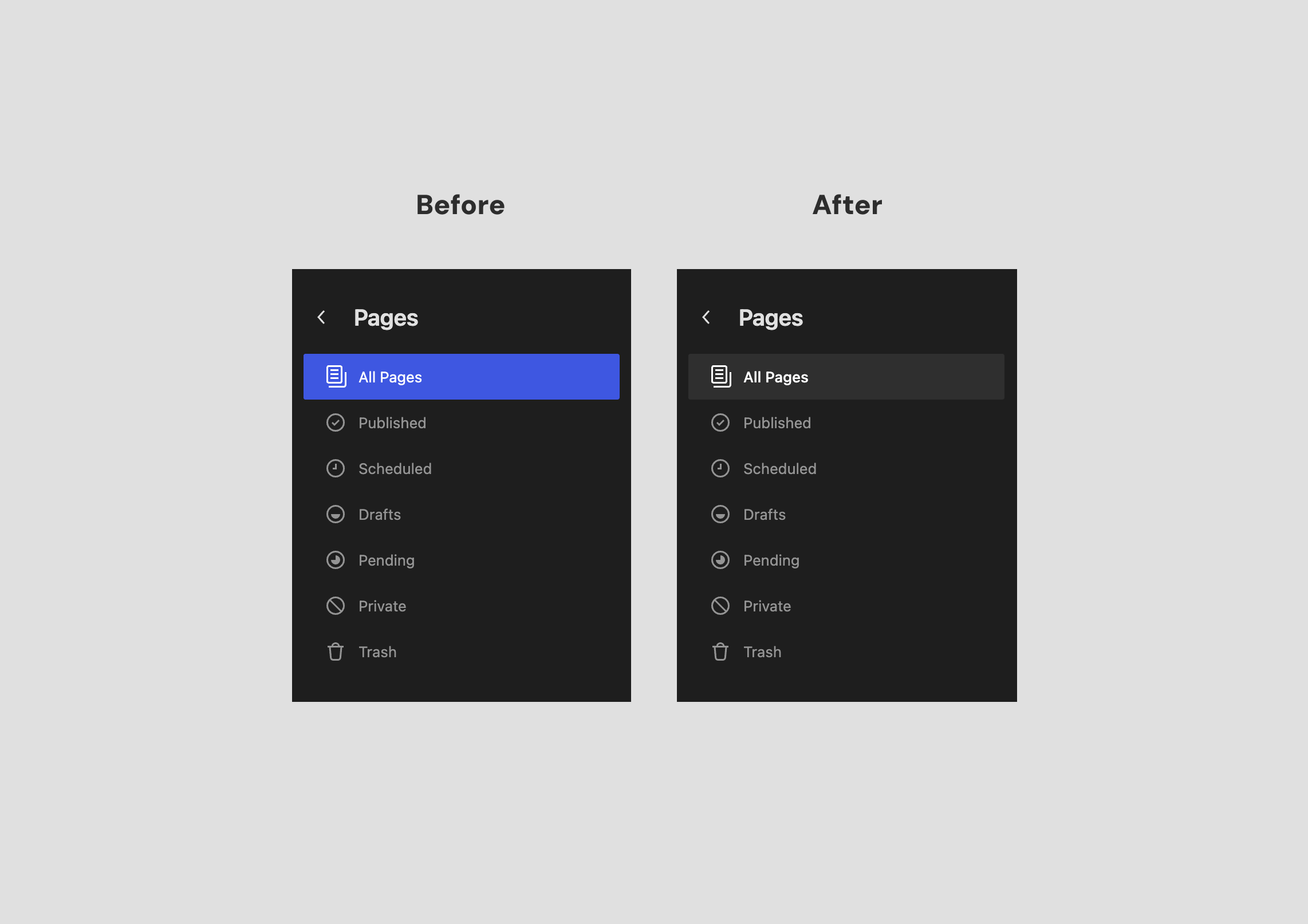
This small visual update accomplishes two things:
- The active menu item no longer resembles a primary button
- Reduces the prominence of the active menu item, which is not as important as primary actions
Menu editing flow
Status: In progress
We continued working on the menu editing experience, but we narrowed the proposal scope this time and framed the design within the Block editor.
System icon
Status: Completed
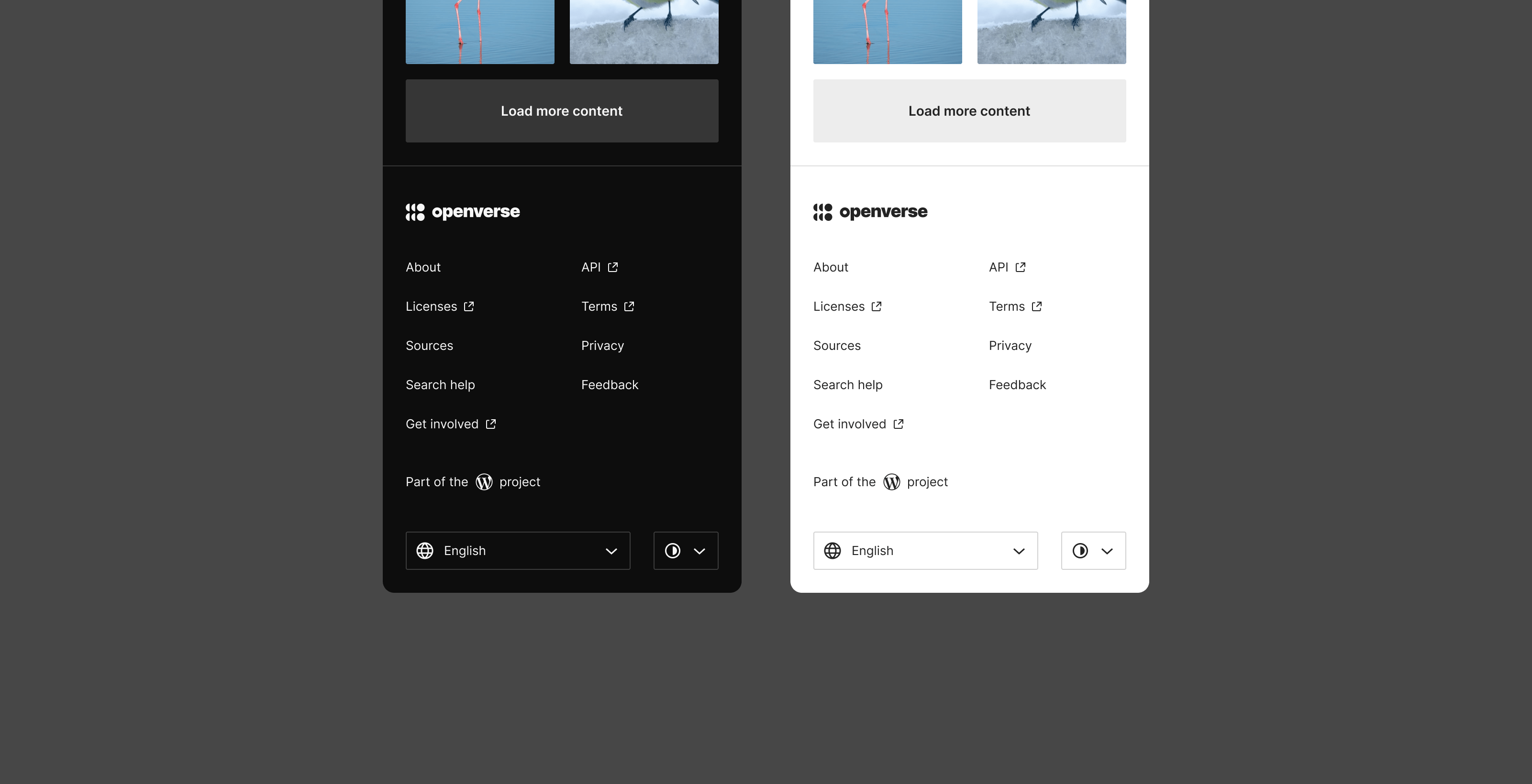
Close to launch Openverse’s dark mode, the team noticed the need for having a system icon for the theme option that inherits the device settings. The icon is already in the Design Library and its implementation is in progress.
Dark mode announcement
Status: In progress


We started working on visuals for the announcement posts that introduce the new dark mode feature of Openverse. The images and videos intend to show the key changes in the UI.
System Updates
As part of efforts to advance the WordPress Design System, the following are visual updates to this effort.
DataViews: Table layout density
Status: Completed

In DataViews Table layout it’s now possible to adjust the density to increase or decrease the amount of visible data within the viewport.
Button: Update appearance of secondary variant
Status: In progress

In 67325 we’re working on some updates to the secondary Button variant. The objective is to improve accessibility by adding a clearer hover style, and better differentiating this button style from text inputs.
New Component: Badge
Status: In progress

In 61106 we’re continuing to explore designs for a new component: Badge. There are a few ad hoc implementations of this element, once a component is formalized we can update these instances and provide a reusable component as a part of the design system.