Dailymotion 是一个视频共享平台。使用 Dailymotion 嵌入区块,可将 Dailymotion 视频添加到您的文章/页面中,并显示播放按钮,这样访客无需离开您的网站即可观看。您无需拥有 Dailymotion 账户即可嵌入文章。
在文章或页面中嵌入 Dailymotion 视频的步骤
- 找到视频,并从浏览器地址栏中复制 Dailymotion.com 上的视频 URL
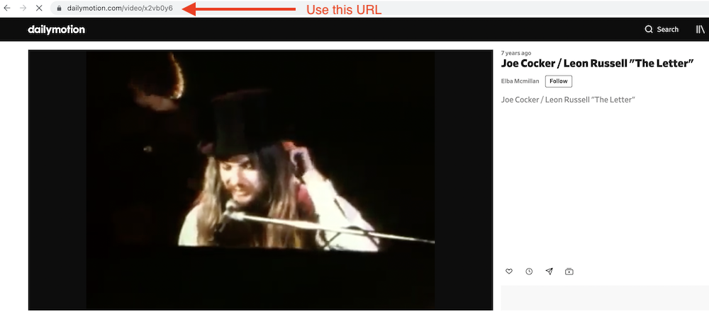
- 向文章中添加 Dailymotion 嵌入区块

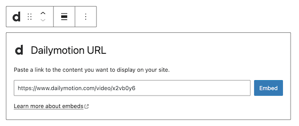
- 将视频 URL 粘贴到文本框中

- 点击“嵌入”按钮
如果链接可以成功嵌入,您将在编辑器中看到预览。
您将在区块编辑器中看到视频,并可以选择在下方添加说明文字。

如果使用的 URL 无法嵌入,区块会显示消息“抱歉,无法嵌入此内容。”您有两个选择:使用其他 URL 重试,或转换为链接。

区块工具栏
除了移动控件和拖放手柄外,Dailymotion 嵌入的区块工具栏还显示四个按钮:
- 转换为
- 更改对齐方式
- 编辑 URL,以及
- 更多选项。

转换为:

您可以将 Dailymotion 嵌入转换为段落、栏或组。将其转换为组后,您可以更改 Dailymotion 嵌入周围的背景颜色。


更改对齐方式:
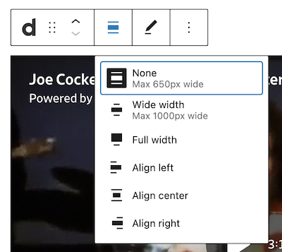
- 宽幅 – 将文章宽度增加到超出内容大小
- 全宽 – 扩展 Dailymotion 文章,使其覆盖屏幕的完整宽度。
- 左对齐 – 将 Dailymotion 文章左对齐
- 居中对齐 – 将 Dailymotion 文章居中对齐
- 右对齐 – 将 Dailymotion 文章右对齐
“宽幅”和“全宽”对齐方式需要由您网站的主题启用。
编辑 URL:
通过编辑 URL,您可以更改嵌入区块中的 Dailymotion 嵌入 URL。覆盖现有 URL,然后点击““嵌入””按钮。
更多选项
工具栏最右侧由三个垂直点表示的“更多选项”菜单提供更多功能,例如复制、移除区块,或将区块编辑为 HTML。
区块设置
除了“高级”部分外,Dailymotion 嵌入在“区块设置”侧边栏中仅有一个其他设置:媒体设置。
媒体设置


通过 媒体设置 ,您可以控制在手机屏幕等较小设备上查看嵌入内容时的行为。
切换开关可开启或关闭针对较小设备的调整大小功能。默认设置为“开启”或蓝色。
“关闭”: 调整浏览器大小时,此嵌入内容可能无法保持其宽高比。在关闭位置,切换开关为灰色。
“开启”: 调整浏览器大小时,此嵌入内容将保持其宽高比。切换开关在“开启”位置时会变为蓝色。
高级
以下高级设置选项可用:HTML 锚点、其他 CSS 类、其他 CSS 和样式。
更新日志
- 更新于 2026-06-29
- 链接至高级设置
- 更新于 2022-11-26
- 移除冗余内容
- 调整图像以适配移动视图
- 更新于 2020-08-27
- 更新 5.5 截图
- 更新于 2020-08-19
- 替换“更多选项”——新截图
- 在“更多选项”下添加“移动到”和“复制”部分
- 更新于 2020-08-11
- 根据 WordPress 5.5 更新截图
- 嵌入 VideoPress 视频
- 创建于 2020-07-27